5 easy tips to improve your web design
In a world where the customer is more and more demanding in terms of quality, we cannot be left behind. We must always seek to be the best. And that includes the design of your website. Your website must have a professional design whenever someone visits it. It has to be clean and give a good impression, or isn’t it the same when you invite people to your home? But that’s why we have created this article where you will learn 5 easy tips to have a more professional web design.
TAKE NOTE!

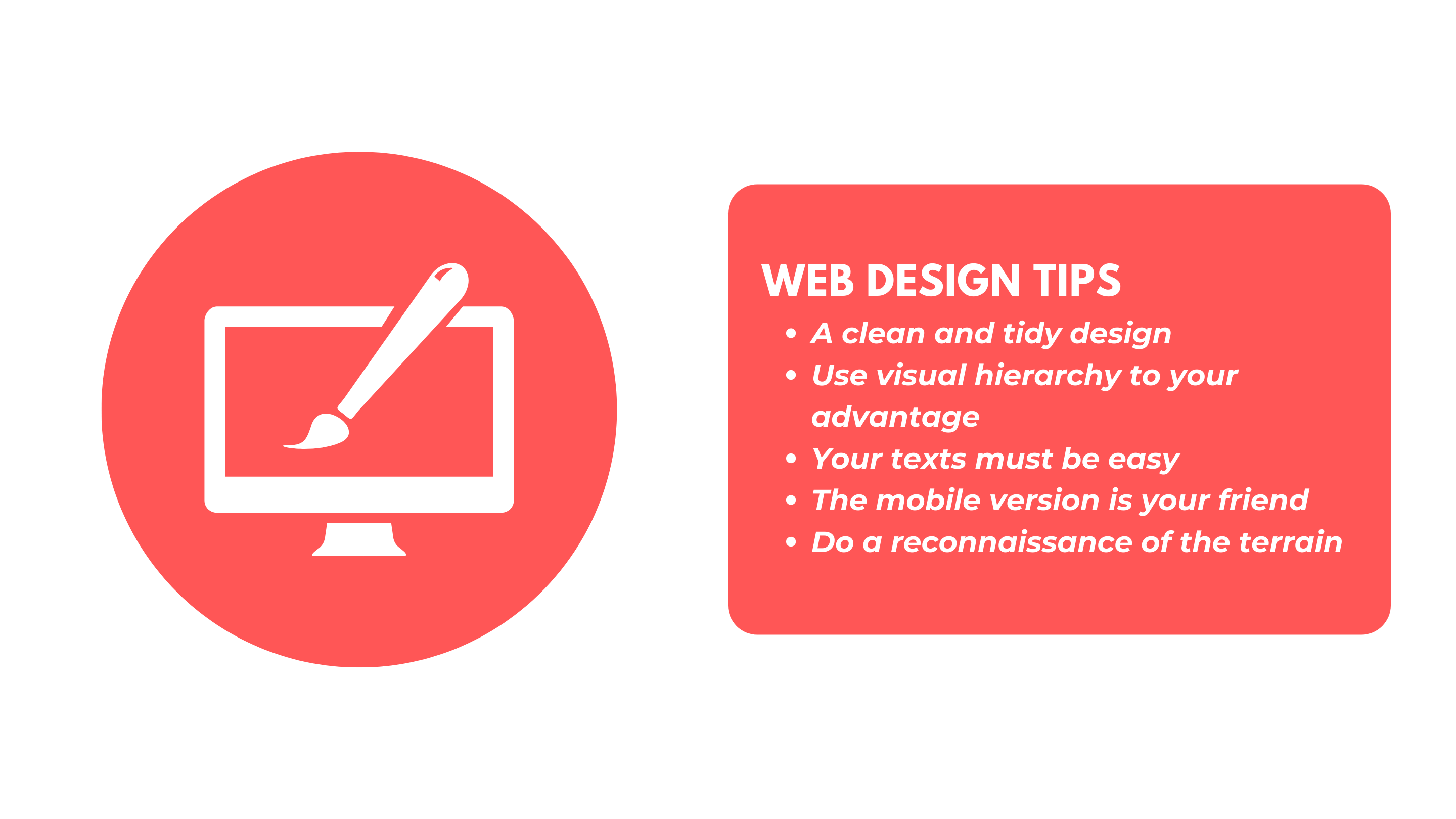
1- A clean and tidy design
Dear user I ask you, how many notifications can we have on the phone in a single day? I’m sure enough to not be able to respond to everything that pops up on your phone. We receive many interactions all the time, stimuli coming at us from everywhere. The world around us has become a bit cluttered and the web is no exception. Ads, banners, icons, pop-ups, badges, buttons etc. etc. etc. Sometimes all of this can be a bit of a drag. So why not give your visitors a break from all the noise and clutter?
But that reason is just why a clean design is so necessary. Your customers are normal people just like you or me. And they also receive numerous digital interruptions on a continuous basis. When you enter a page with lots of buttons, photos, text here, menu there, we don’t know where to look. A tidy web design where there is harmony and order makes everyone feel much more comfortable.
Also don’t forget to try to include only the necessary elements. This means don’t make a menu with too many options, keep it simple. With the amount of interactions that we people suffer a basic and minimalist design reassures us when we get to a website. It doesn’t upset the user because they find what they want much faster. It is easier to look at what we put because there are fewer elements. The web is less cluttered and allows the user to navigate with more freedom and focus on what they are looking for. Many times, less is really more.
2- Use visual hierarchy to your advantage.
Let’s be clear, visual hierarchy is a design strategy used to make your eyes pay attention to some figure or element in the design. For example, if we paint two circles, but we paint one larger, it will have a higher hierarchy than the other circle. The same happens if one is a very bright color. Hierarchy has many ways of being achieved in the design, through size, shape, color, or by elements surrounding the main subject.
What is this good for me? Well, because in your web page not all elements have the same importance. There is always some text, image, some section where we want the user to stop for a little longer. Maybe it is the advantages of our product over the competition, or an offer. But we have to find that element and use it. It can be anything from a “sign up now” button to a Text that we know drives the sale.
Our web design has to guide the user’s brain to those most promising areas. Visual hierarchy tells us that the eyes move from top to bottom, left to right, this is a Z-pattern of how we read text. We start on the left side, continue to the right, and move to the next line.
This means you’ll have the most eyeballs on the top left side, and those eyeballs could very well mean more clicks. It’s those kinds of little things that you have to use to sort your content in the most optimal way. Remember to put in those spaces the most important things, putting too many things can saturate and generate the opposite effect.
3- Your texts must be easy.
I don’t think at this point there is any doubt about the importance of the text. In a physical store we have the salesperson who tells you that it’s the best. Who uses his nice smile, and his candy word to explain the benefits of a product. But on a web site we don’t have that clerk. The smile is the web design, and the words are the texts. Now it’s time to get into that second part. Because your texts can make the difference between the user continuing to read what you have to tell him or leaving, and finally help him decide whether to compare or pass.
Text matters, and so does its size. It is there to provide information, to answer questions before they arise. There are a few easy rules you can use to give a twist to this very important detail of web design.
The first thing we’ll mention here is the issue of color. More than once in Local Max we have come across white text on light colors. It is important that your text is on a background that allows easy reading. This section is also worth mentioning that colors are important throughout the web. Your text can be a sales machine, but if it is not understood you will never know what is going on.
Size matters, and text size matters too. Seriously, don’t do weird things with text size. Many times we think we are creative because we mix paragraphs in different sizes, and although this may be an example of playing with hierarchy, it never works. Use a font size according to your page.
Extra detail about the text. Don’t change fonts every now and then. You can’t have a website with more than 2 or three different fonts. Here I say the same thing, don’t get creative by using more fonts. It distracts and interrupts the reader. Besides always using the same typeface, make sure it is understandable at a glance, something that reads fast and does not look like another language.
4- The mobile version is your friend
You can follow these steps to the letter, follow every advice, change your website and make art. But if your mobile version is not at the same level …. we are not doing well. There are more and more devices connected to the internet, to the net, to the digital ocean. And many of them take their mobile phones with them wherever they go. We have seen how the mobile takes control of our lives, and this is reflected in the web searches, where more and more are made from the mobile. That’s why you need a website that can keep up with these searches.
And for you, a physical business owner, this is of special interest. When your users are in your Google maps profile they expect to find your website. If they also visit it I am sure they will do it instantly and will not wait to get home to connect from the computer. So, take care of your mobile design almost as much, if not more, than the web.
Make changes that keep all of the above in the same line. Use the above to see how the mobile design takes shape. Don’t make it too different because when your regular customers visit you from another device they will be able to find their way around more easily.
5- Do a reconnaissance of the terrain
This may seem simple, but look at others. Activate the analyst mentality and when you are visiting any other website look at what works for them. Look at the direct competition you may have, investigate how they do it on other sites and if possible apply it to your own site.
Take notes of what you think will work, what you think will help you in your mission. A good analysis of a site will shape your view so that you can see mistakes to avoid on other sites, and also on your own. It can be something small like symbols, arrows pointing to a button, forms asking for your email. Be alert and don’t stop looking for these details.
Conclusion
In conclusion, we can see how web design affects users more than we think. That’s why we have to pay attention to certain details to sharpen our website. These five tips do not have a unique way to be applied, use what works for you. Give yourself time to test the changes and see the results. Learn from your mistakes, ask customers for their opinion, use that feedback. Don’t forget to follow us for more tips and bombard us with your questions.

